Music Album Mockup Case Study
Program Used: Adobe Illustrator

Objective
The design concept through this mockup is to choose a type of music artist, and to design an album that connects to the artist in a typographic design. The overall concept of the cover involves no imagery or other graphic elements, and conveys a message that connects to the album and artist.
Album Concept Choice Information
Music Artist
Fleetwood Mac
Genre
- Pop Rock
- Soft Rock
- Blues Rock
- Art Pop
- British Blues
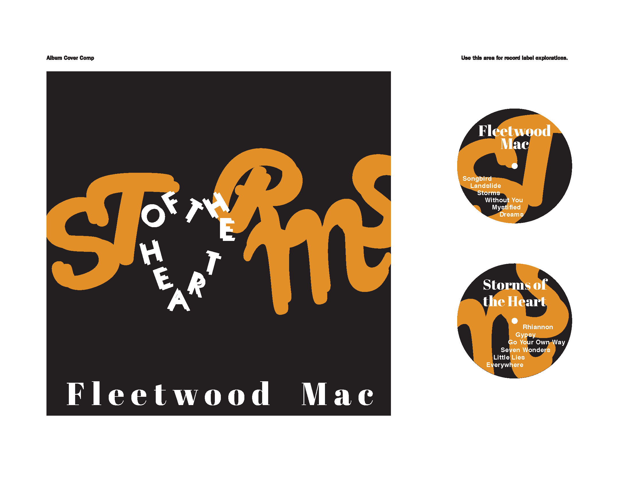
Track List
- Songbird
- Landslide
- Storms
- Without You
- Mystified
- Dreams
- Rhiannon
- Gypsy
- Go Your Own Way
- Seven Wonders
- Little Lies
- Everywhere
The custom album cover idea I chose to do is the British-American rock band, Fleetwood Mac. This music band I’ve listened to at a very young age. Listening to the lyrics of the 12 tracks I’ve chosen, all these songs deal with love and relationships. These relationships involved are either good, bad, or otherwise, and it has a lot of meaning to them. The tracks range from slow, to upbeat. Some of the tracks are a bit more upbeat, but a few of them have sounds of chimes throughout.
Original Concept Title Ideas:
- Nocturnal Beats
- Spiritual Night Rhythms
- Mellifluent Melodies
- Love Harmonies
- Mystical Musings of the Night
- Rhythmic Reflections
- Melodious Manipulations
- Lyrical Longings
- Heartstrings
- Spirited Tunes
Moodboard
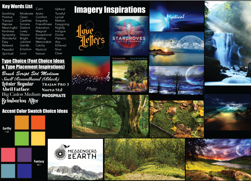
When gathering concept choices to create an album mock-up, I first gathered the design choices for a mood board to pick and decide for the final look. My idea for the look of the album is to go either for a fantasy or earth-like abstract design. The typography choice Ideas as shown in the mood board have different forms ranging from script, serif, and even monospace. The colors idea choices I placed are the cool colors (blues and purples) for if I were to choose a fantasy-like concept, and the warm colors (reds and oranges) for if I were to choose an earth-like concept.
Process Sketches
Iteration Sketches
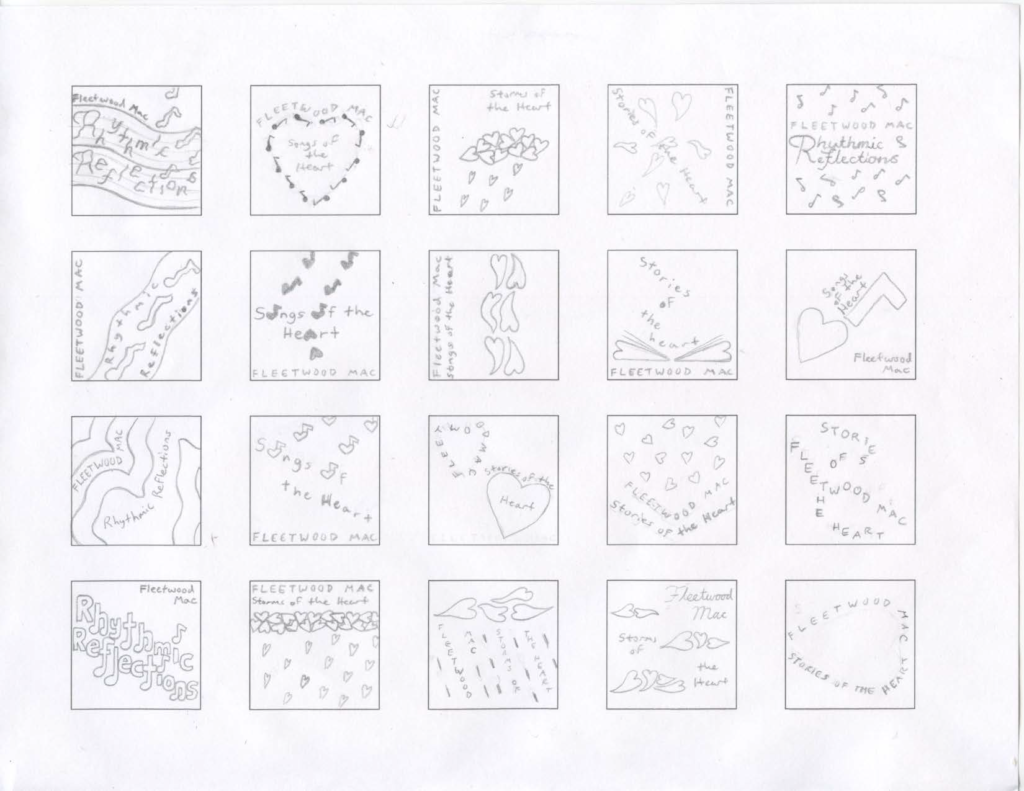
Top 4 Idea Choices
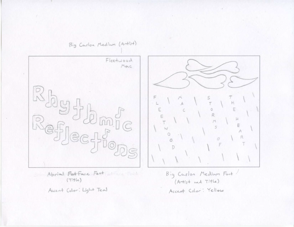
Originally, I was thinking of using the title “Rhythmic Reflections” for my album cover, then I thought of these other titles:
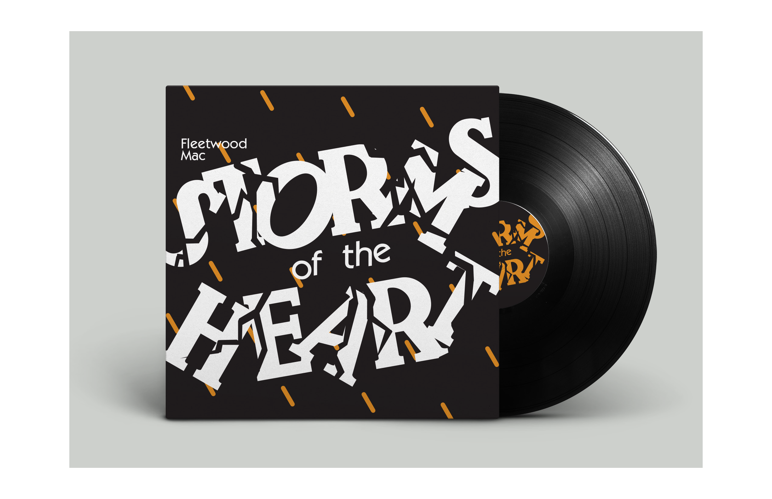
- Storms of the Heart
- Stories of the Heart
- Songs of the Heart
One of these titles, as well as the top four designs for them, I think would work best. The main goal to connect the album cover with the songs is expressing emotions expressed in relationships, and I feel a lot of what we express comes from the heart.
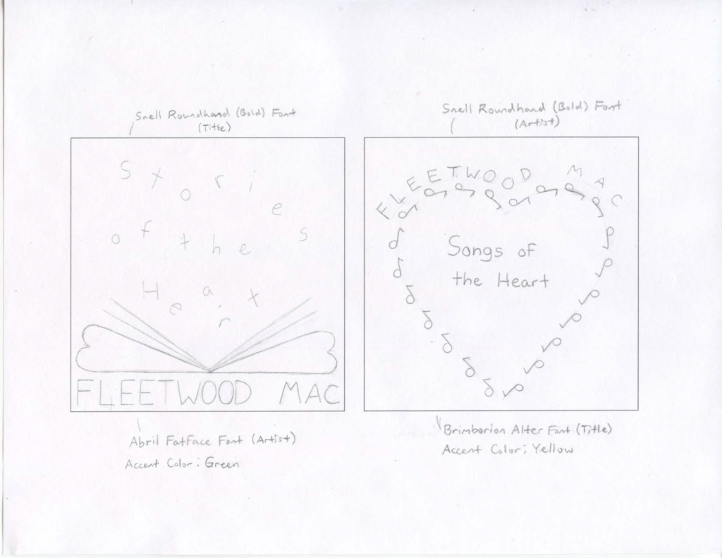
Digital Composition Designs

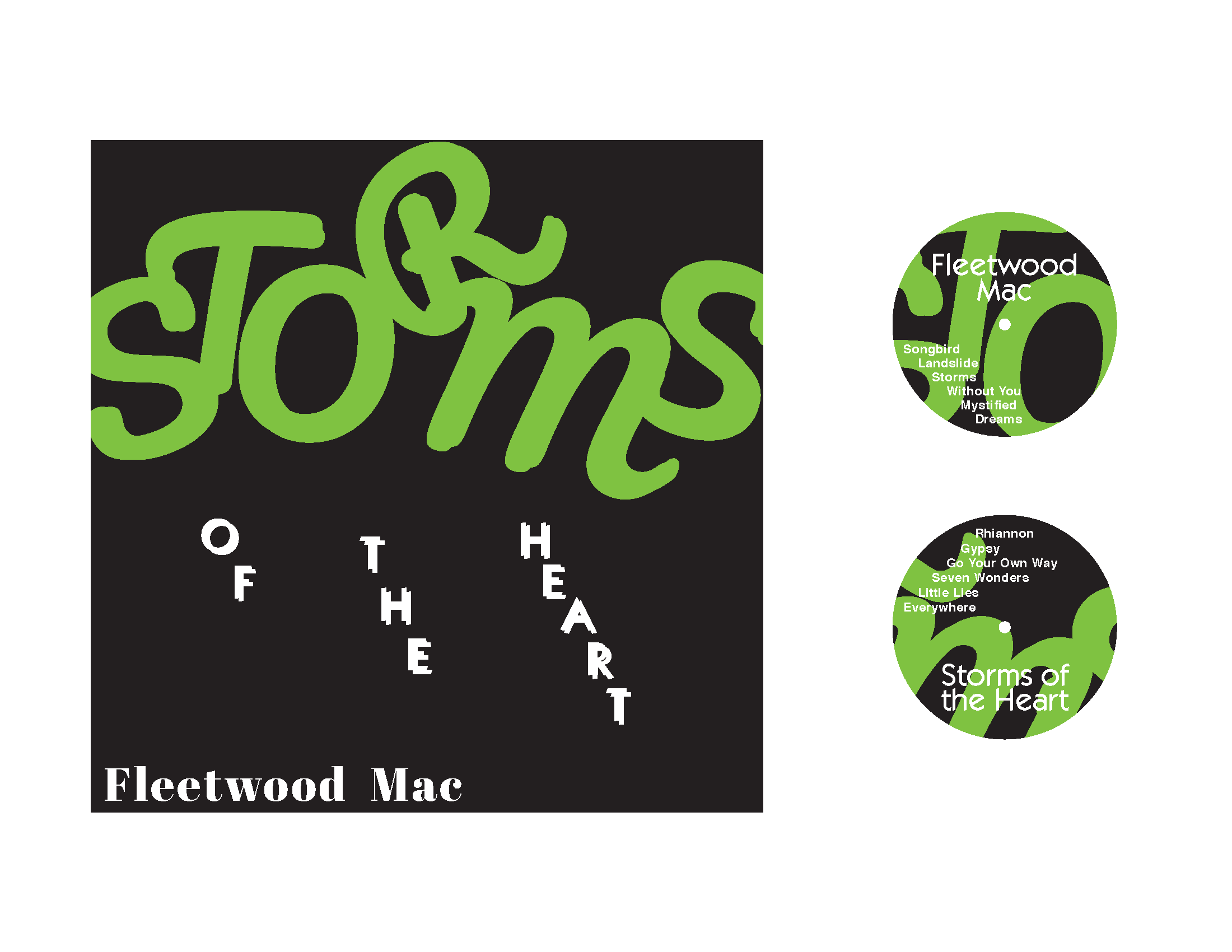
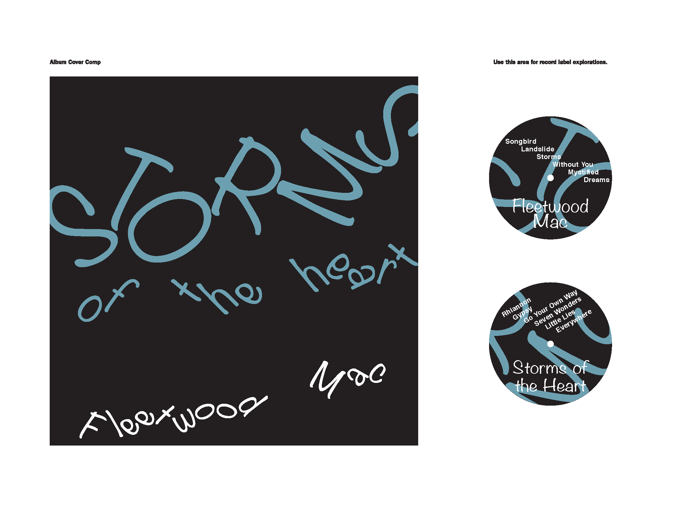
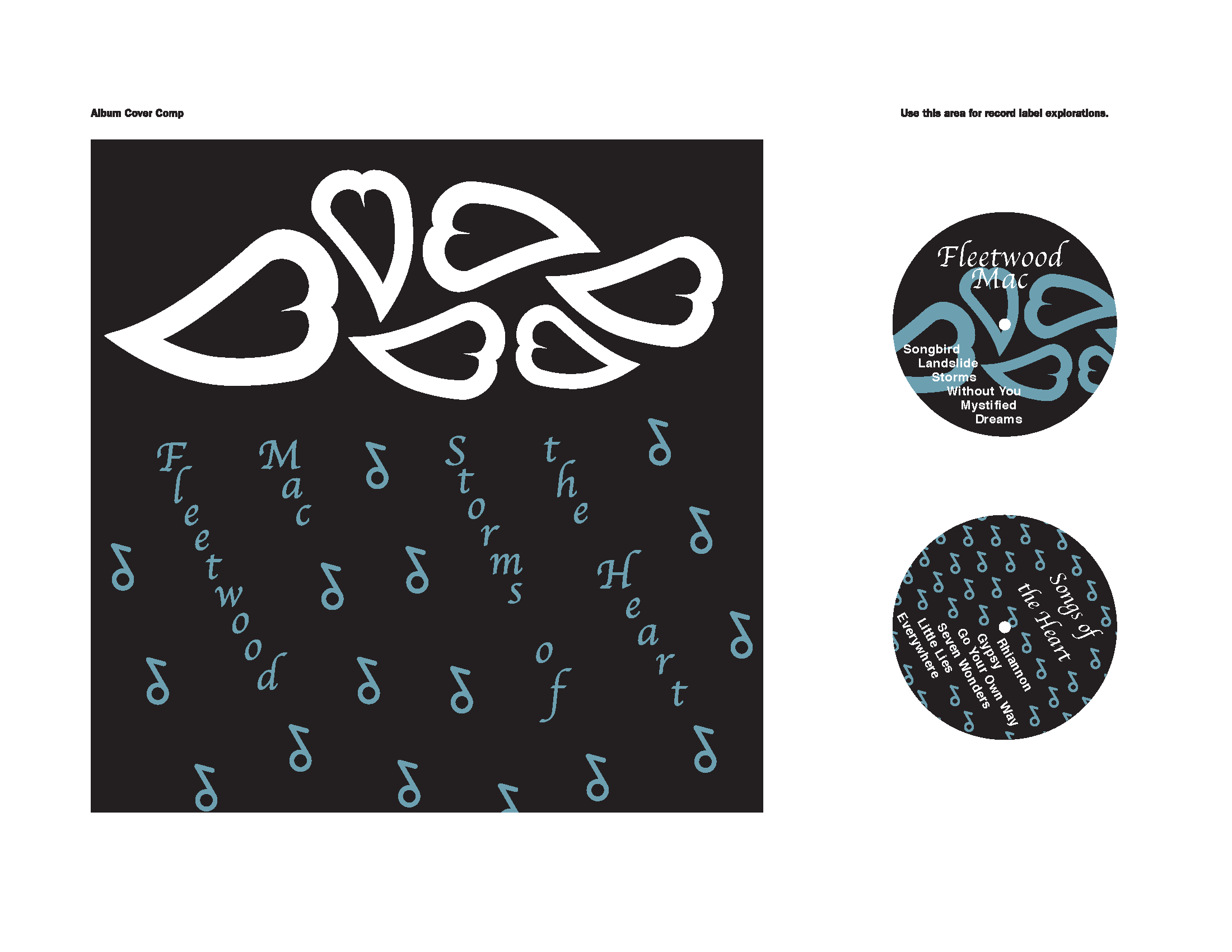
The digital iteration concepts as shown were my original ideas before choosing and redesigning my final album cover. I went with using the fonts I typed in to resize, reform, and shape to make the cover from the top four album cover sketches I’ve made. Although, some of my concepts looked too literal, and almost like a graphic image. These digital iterations didn’t fit within the message for the songs and the type of message they’re sending.
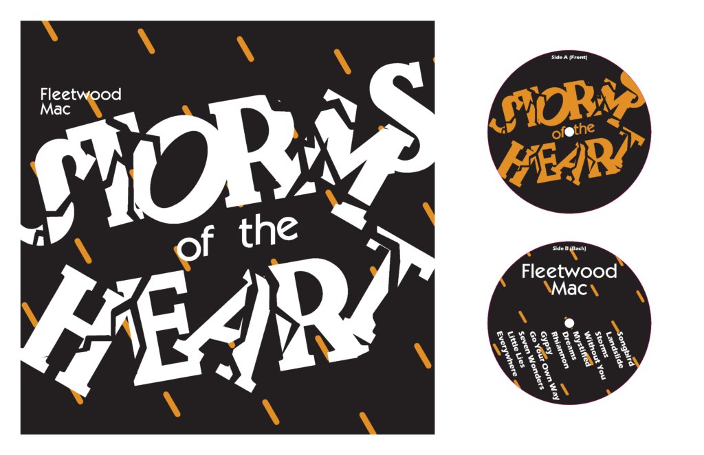
Final Design
After some feedback from the iterations I created for the mockup album cover, my final design for the album needed a big improvement to incorporate the look and feel. The design outcome has been incorporated from two of my concept iterations: One where the text looked like it was blown away, and the other where the design seemed like a graphic image of a rainy cloud. Both of these two concept iterations helped combine them both to give off a symbolic message that would grabs people’s attention to listen to the album.
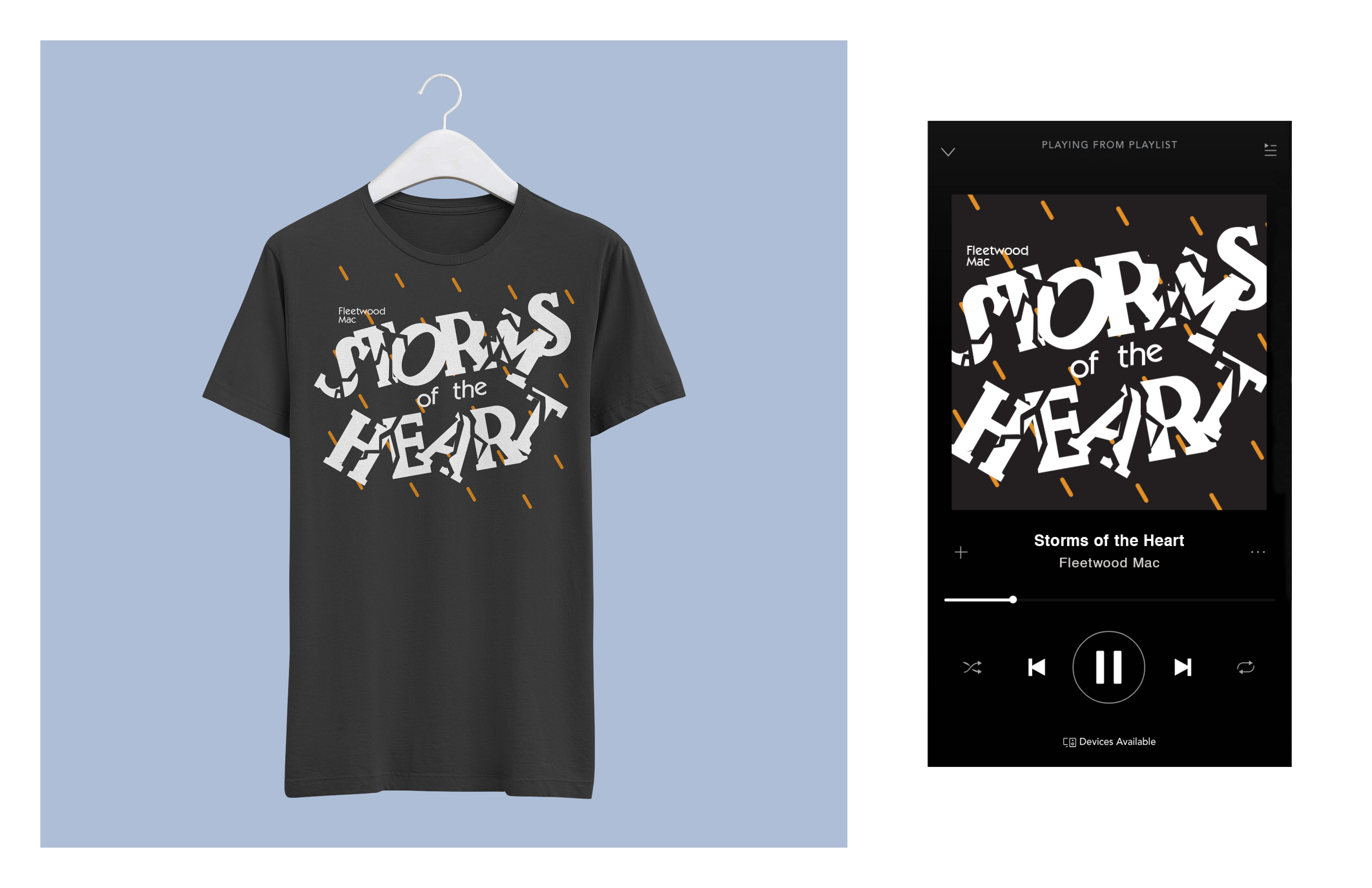
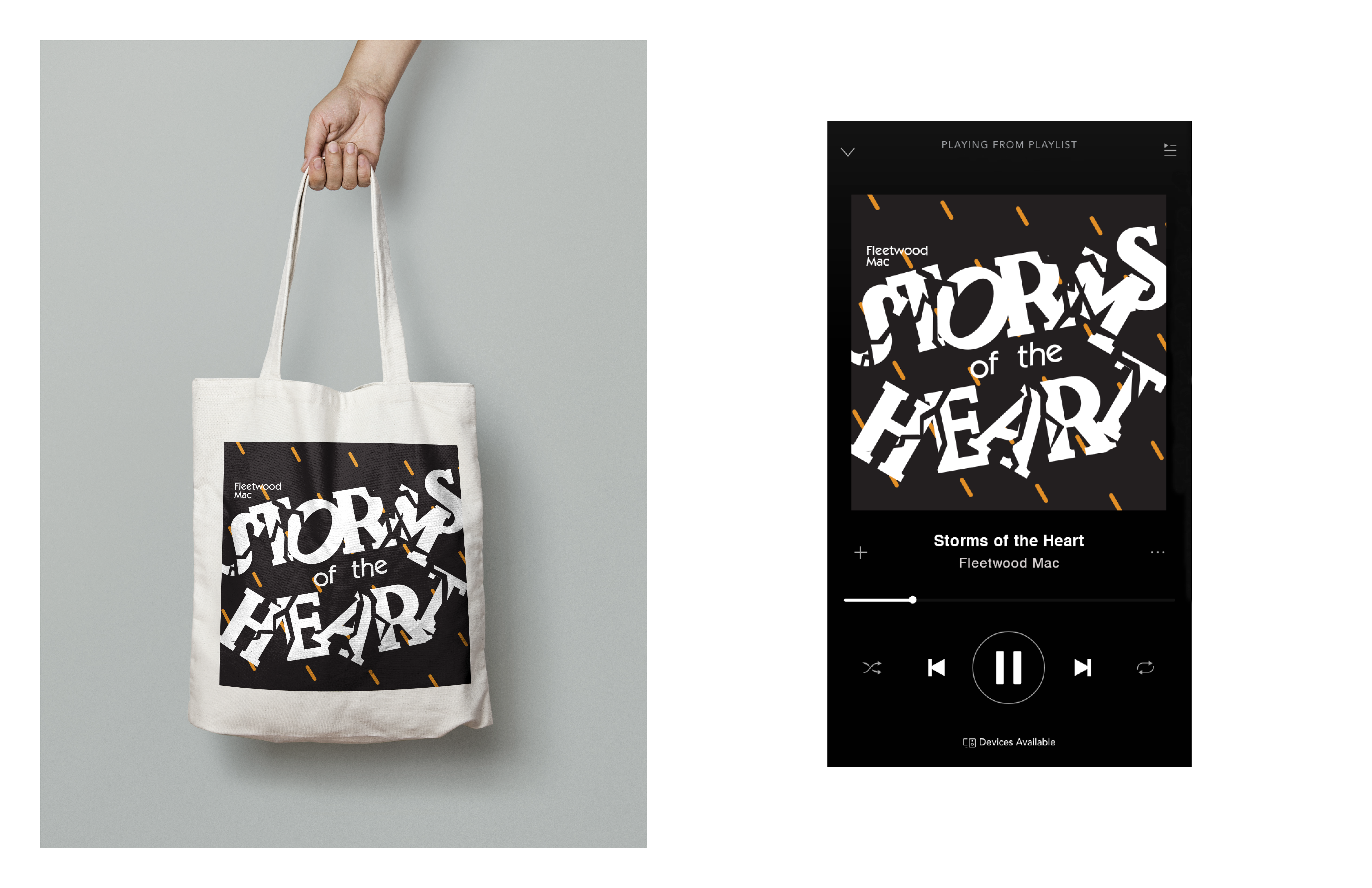
Album Cover & Mockups

Design Process
What I Learned Through Designing
- Ideas could combine designs/shapes together to complete the overall concept
- Multiple iterations could possibly be combined
- Overall design of the project doesn’t have to be literal, but can be symbolical
- Ideas can be modified back and forth (Title Name or Design)
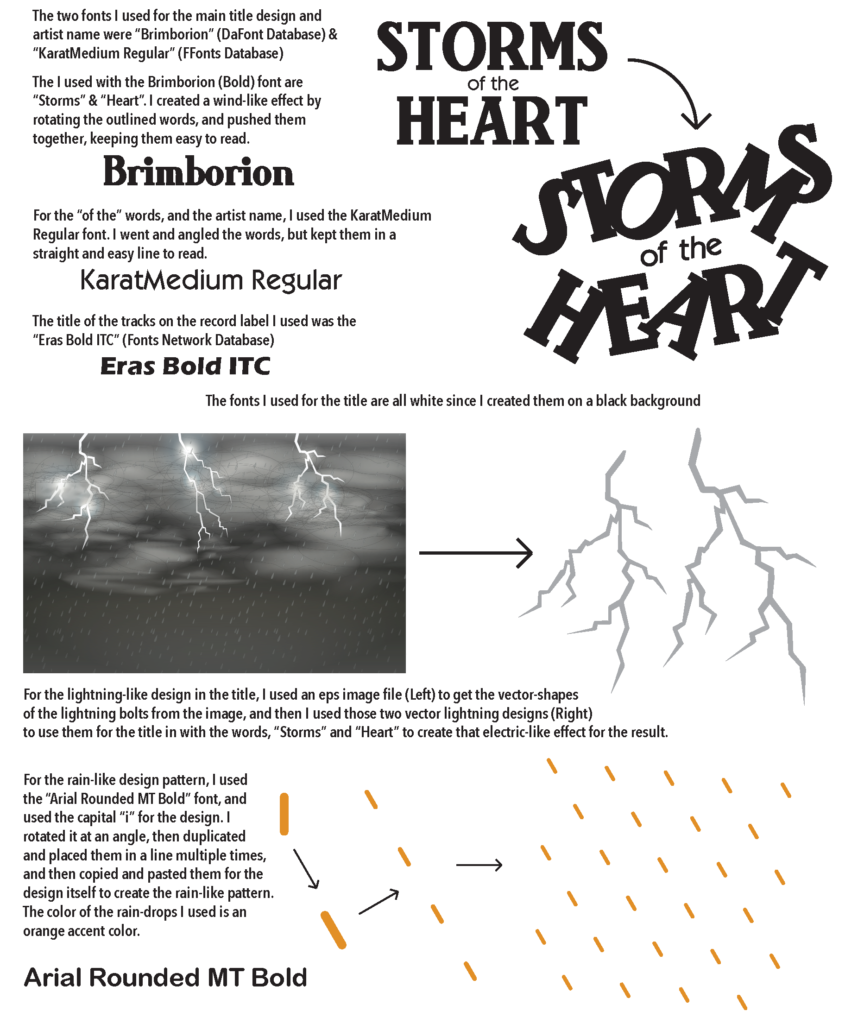
- Certain typography can be used as visual shapes while working on a project like this
- This project involves research getting an understanding of the artist, songs, communication, and music to piece them all together, create the look and feel of the album